Типы графиков для финансового сектора в Power BI
Оригинал тут → https://sqljason.com/2018/12/financial-times-visual-vocabulary-power-bi-edition.html
Financial Times Visual Vocabulary: Power BI Edition
Ok, finally it is done! This is a side project that I have been undertaking on and off for the past 2-3 months, after getting inspired by Andy Kriebel’s (t | b) Tableau project – Visual Vocabulary. There were a lot of times when I thought it simply wasn’t worth the effort, and I dropped it. But somehow I managed to drag myself back into it and it truly has been a “labor of love” as Andy quoted it. The perfectionist in me is still not 100% happy with the end result, and I know for sure that there are ways to make it better. But I will still count it as a personal victory that I managed to get it this far!

Background
The Financial Times Graphics team created the Visual Vocabulary poster to help all of us make better chart choices. And based on this, Andy Kriebel created the interactive Tableau Edition of the the same.

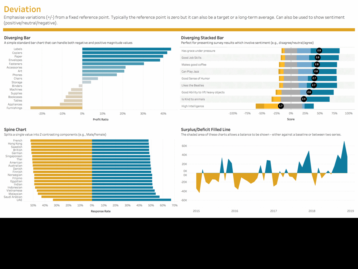
I was so inspired by it that I decided to create the Power BI Edition, and tried to make it as similar as possible. I also added a few more charts that I thought are relevant. Without further ado, here is the end result.
Note that there are some R/Python visuals and currently, R/Python visuals are not available on “Publish to Web”. Hence, I have just used a checkbox on the top of the report to show the images wherever R visuals are used (can be identified by the colorful border around the image). However, you can download the source file and then publish it to your tenant, and see the actual R visuals there in a browser by unselecting the checkbox. You can also look at the pbix file and see the source code behind the visuals.
Credits
- Andy Kriebel (t | b): Thank you for all that you do for the #dataviz community. I wouldn’t have tried this project if I had not seen your post. Even the design as well as the data for most of the visuals are copied from your Tableau Workbook.
- FT Graphics Team (link): Alan Smith; Chris Campbell; Ian Bott; Liz Faunce; Graham Parrish; Billy Ehrenberg; Paul McCallum; Martin Stabe
- Power BI & Tableau Community: for sharing all your amazing #dataviz techniques. The tools might be different, but the techniques that you learn in one tool can easily be applied in others. E.g. – creating cartograms in Power BI became all the more simpler because of the Tableau community blogging about using Alteryx to generate the shapefiles. And a huge thanks to the creators of the Power BI Custom visuals – this project would not be possible if it wasn’t for all your effort in creating and sharing those custom visuals.
- Konstantinos Ioannou (t): for opening up my mind regarding the potential of R/Python visuals as well as creating most of the R visuals in this project.
- David Eldersveld (t | b) – for being my sounding board
- Nujcharee (t) – for creating Violin Plot visual using R for me and kickstarting my R visuals journey
- Pragmatic Works (b) – for blogging about all those amazing custom visuals in Power BI
Source File
You can download the source file from here. Note that you will have to get your own MapBox tokens to view some of the maps in the Spatial section. More info on the same here.
Tutorials
This section will be updated with links on how I created those charts (if I can drag my lazy ass back to this once more!).